Jones Excavating does the heavy site work; Callus Fabrication is the welding shop in the same family. Two very different trades that needed to look as serious as they are — so we designed a brand and site for each, built to share a bloodline without looking the same.
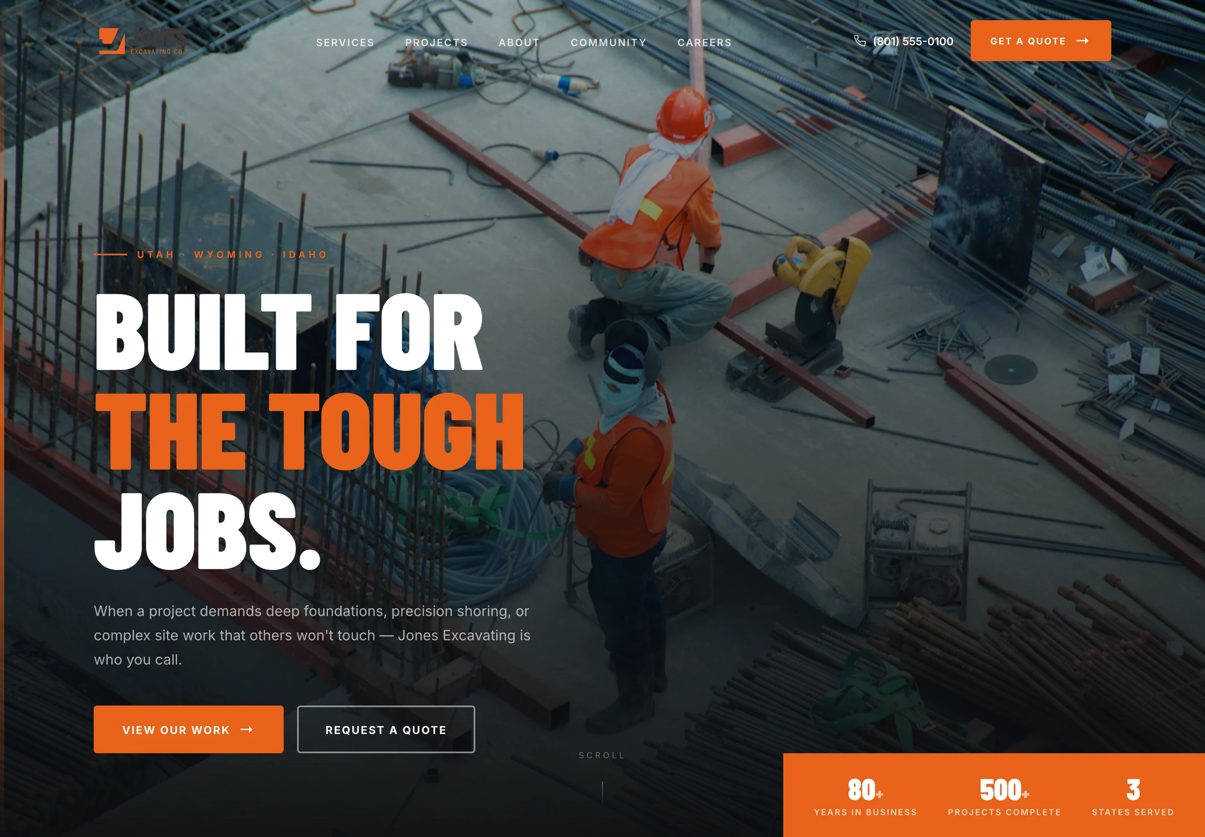
Jones Excavating has been moving earth on the Wasatch Front for decades. Callus Fabrication is the welding and custom-steel shop in the same family. They share customers, a reputation, and a region — but a backhoe company and a mobile welding shop shouldn't wear the same clothes. The job was to give each a brand and a website design that stands on its own while still feeling related.
Excavation is about trust under pressure: deep foundations, precision shoring, the site work other crews won't touch. So the design is confident and plain-spoken — heavy condensed type, construction orange on steel-blue, a hero that puts real crews on real jobsites front and center. The headline does the selling: "Built for the Tough Jobs."
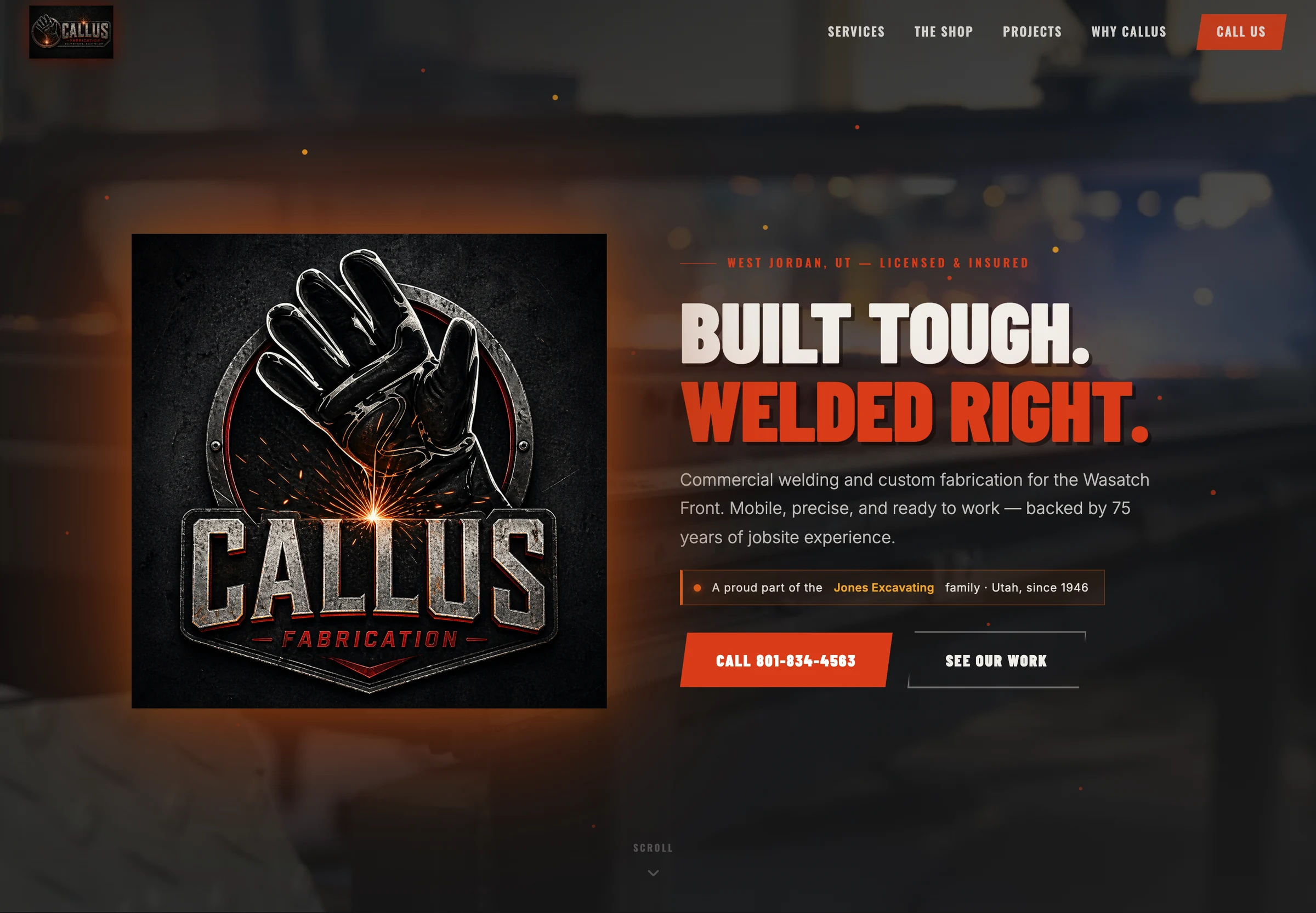
Fabrication is hotter and more hands-on, so the Callus direction runs darker and grittier — a forged, metallic logo throwing welding sparks, deep charcoal and ember-orange, and a headline with a craftsman's swagger: "Built Tough. Welded Right." A small line ties it back to the family: a proud part of the Jones Excavating family.
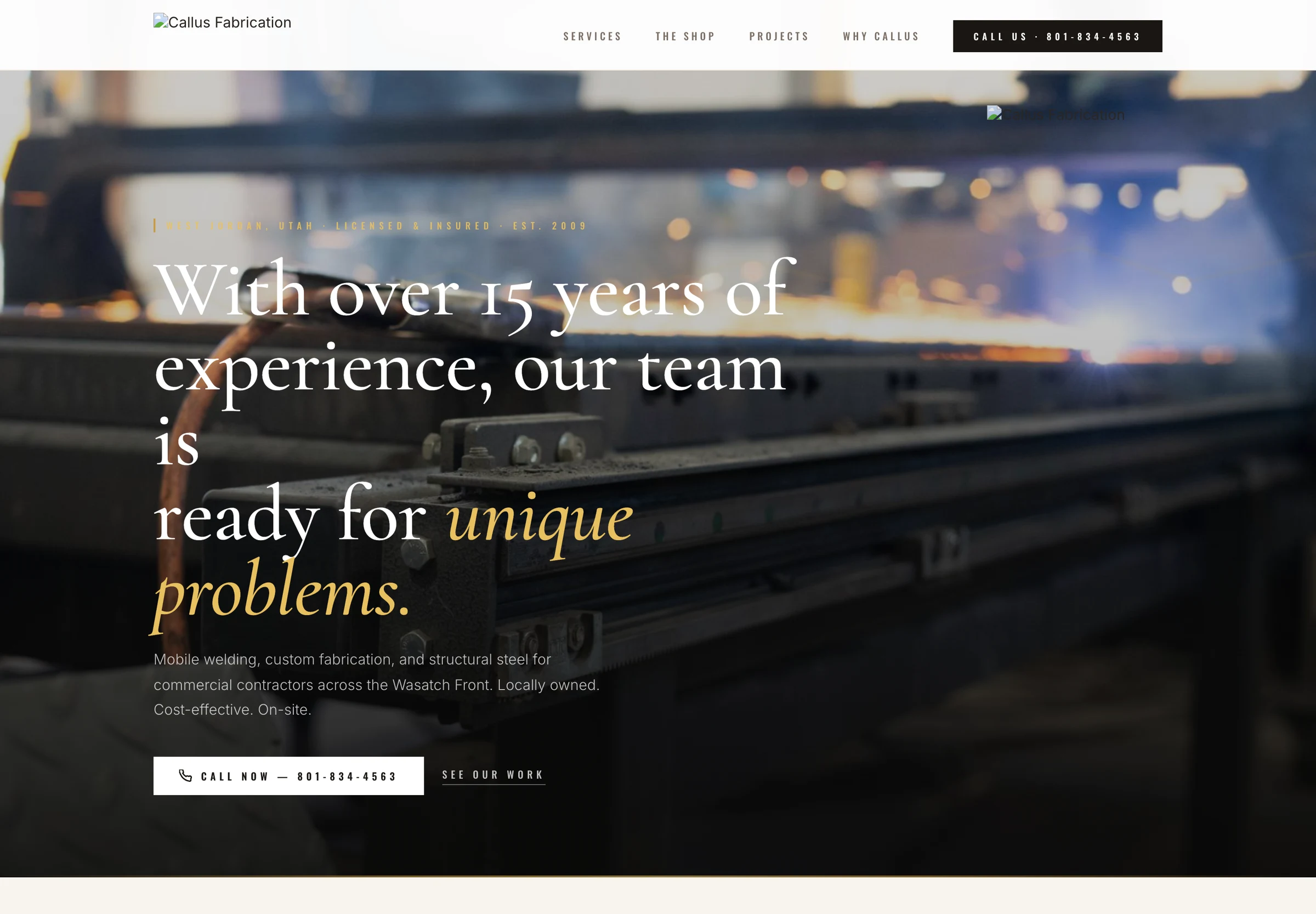
Related, not identical. The two brands share a backbone — bold condensed type, an orange accent, an honest blue-collar tone — but each is tuned to its own trade. Put them side by side and you can tell they're family. Put them in front of a customer and each one holds its own.
Deliverables
Let's build
Free 30-minute consultation. We'll map the system, the savings, and the shortest path to live.
Book a consultation →